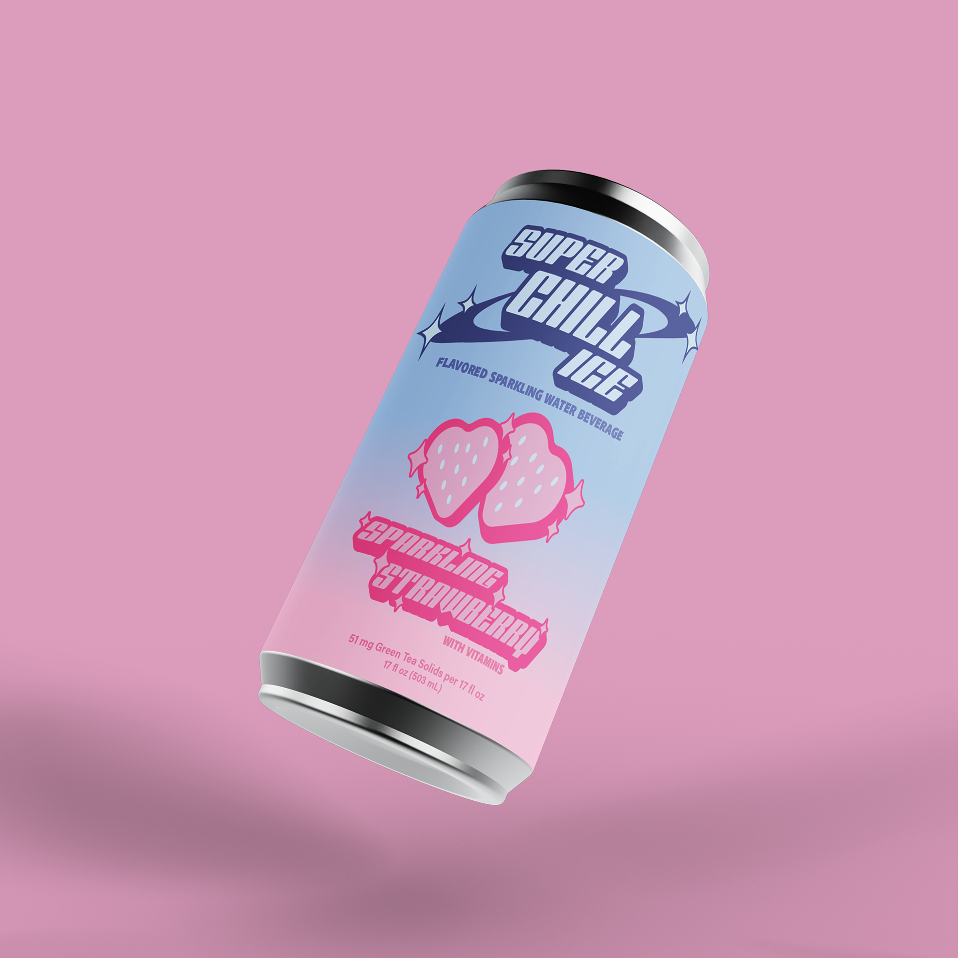

Super Chill Ice Redesign
Packaging Design, Logo Design
Inspired by Y2k design, I wanted this redesign of Super Chill Ice to be bold, playful, and nostalgic. As Y2K design is often characterized by its notable blend of retro-futurism and digital aesthetics, I designed the logo with those aspects in mind. I also wanted to reflect aspects of the drink itself in my design, hence sparkles to represent the sparkling beverage. This continues into the use of pink to represent the strawberry flavor and beverage color. The use of bright pink, as well as the semi-abstract-shaped strawberries,

